DailyPost 946
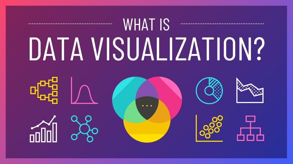
DATA VISUALISATION
The world is suffering from data overload and data glut and with so much there on offer, has your perception of your work and the world changed? Should have, because earlier we have been cribbing about non-availability of data. Has data helped you manage your work better, made you more productive, made you more conversant with facts and figures that matter for you the most and most importantly has your comfort level with the job you do increased considerably? And the most important of it all is whether it has made a dent in the drudgery and taking our large part of stress and strain out of job at least till the middle management level.
The growth has been form tables to bar diagrams to pie charts; the consultant language. Some odd smart art and market templates are added to the ppt understanding of facts / figures/ information and the narrative. The smarter digital ones have dashboards and pop ups. Has all this a click away, changed the work environment, the understating, the capability to handle data sensibly every time. Human mind is more comfortable with visualisation and more so when it needs clarity, correct perception and understanding and if the the data to make a lasting mental imprint.
Visualisation in lots of creative / engineering areas are the mainstay. In data / information it is gaining ground. It declutters the data landscape. Only relevant data points appear and visualisation as a technique makes it come alive, every element is conspicuous by its presence and narrative hits the mind, without any text element.information Design is critical. In the book titled Connectography, Parag Khanna has used this tool extensively, adding a fascinating dimension to Cartography, modern connectedness study & its impact.
The millions of lines of coding in a software will not throw up the discrepancies; by default or by design and this tool comes in handy, it’s able to express in a dynamic manner and the patterns tell the tale, where computer or human languages fail. Dynamic visualisation used in other areas where data remains untapped to our regular sensible understanding can crisply and cogently give the narrative. An effective tool of Data / Big Data Analytics.
DATA VISUALISATION IS THE PRISM TO UNDERSTAND DATA.
Sanjay Sahay